ORC Design Guidelines
Intro
Starting from May 2023, ORC proudly presents its new identity, featuring a fresh logo, vibrant colors, and modern typography. This page serves as a comprehensive guide to the key elements that define the ORC brand, offering convenient downloads for various logo versions. For any inquiries, reach out to support@orc.org.
Logo
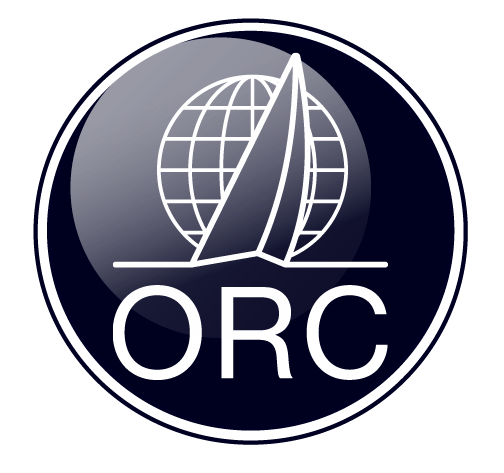
The ORC logo comes in different versions and color schemes tailored for specific purposes. Click the link below to access all available variants for free. Please note that the use of any logo versions obtained before May 2023 will be phased out.
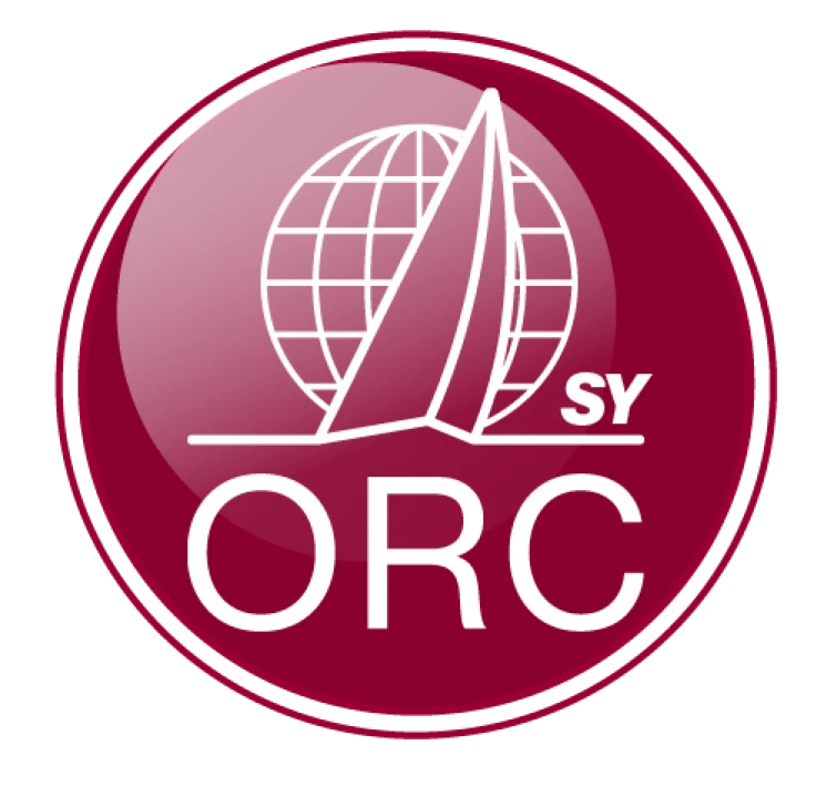
Additionally, you can download all ORC Class logos, available in both positive and negative variants.
ORC logos
ORC Class logos
The logos provided must be used as they are, with no alterations. It is not permitted to add text, stretch or distort the logos, or apply any effects to them.
- ORC International
- ORC Club
- ORC Super Yacht (ORC SY)
- ORC Multihull (ORC Mh)
- ORC Classic


Typography
Neue Haas Grotesk is used for all ORC material. It is a legible and versatile typeface with roots in Swiss precision, chosen to reflect the precision and accuracy of the ORC rating system.
To ensure a cohesive look, all headings should be set in the regular variant of Neue Haas Grotesk Display, while body text is set in Neue Haas Grotesk Text. The body text also allows use of the bold and italic variants to ensure versatility.
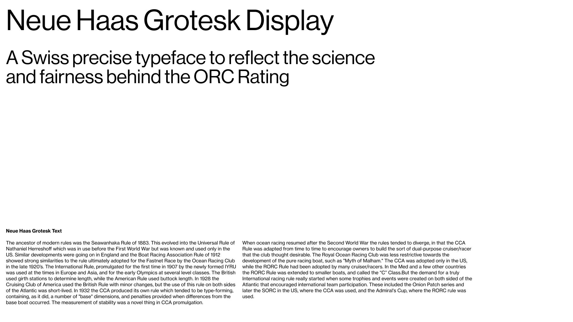
Neue Haas is included as a free download on Adobe Fonts in the regular Adobe subscription, the download link is found below.
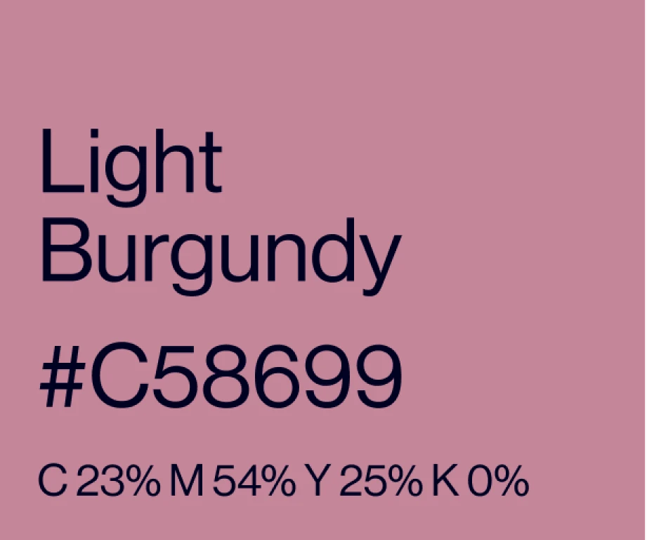
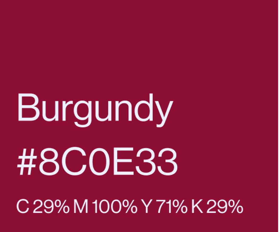
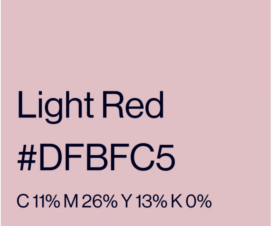
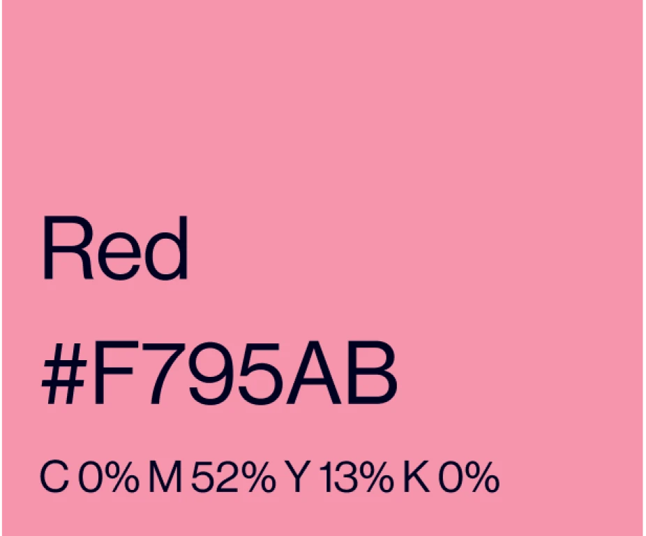
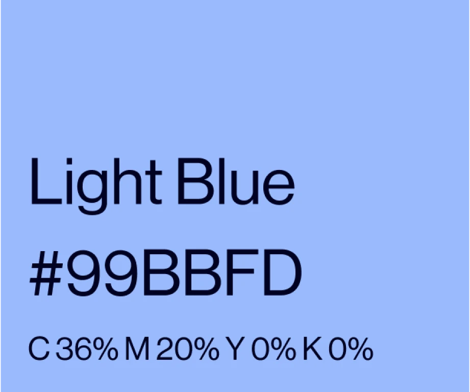
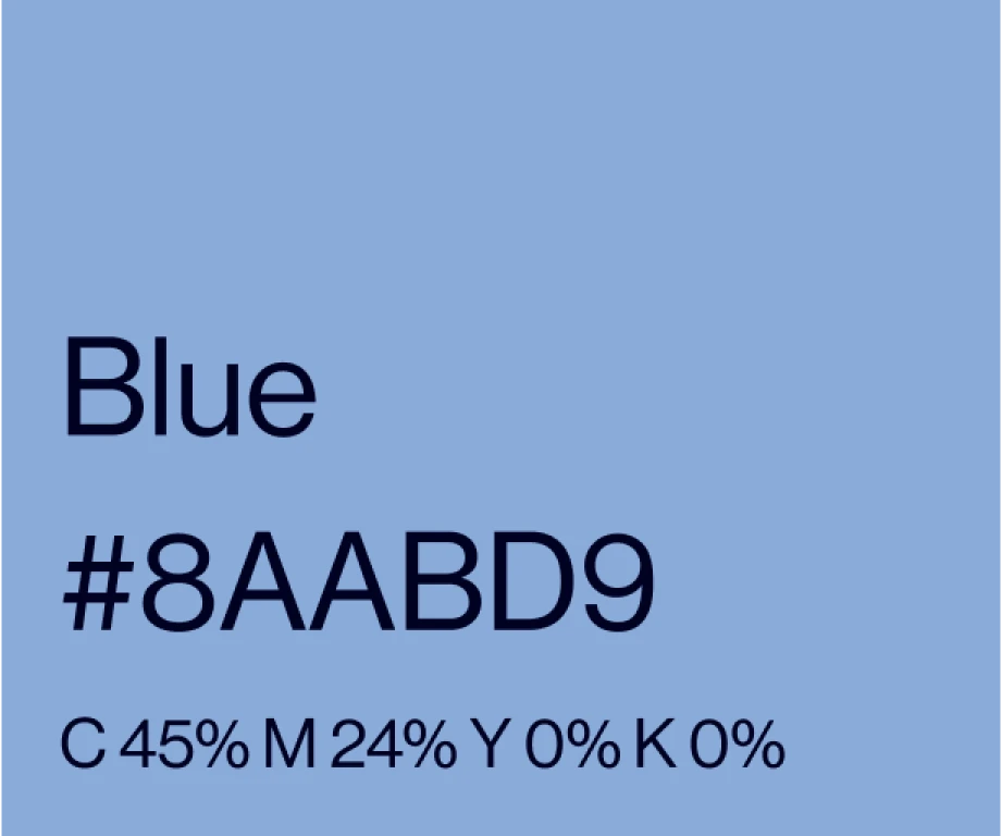
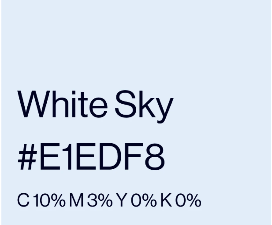
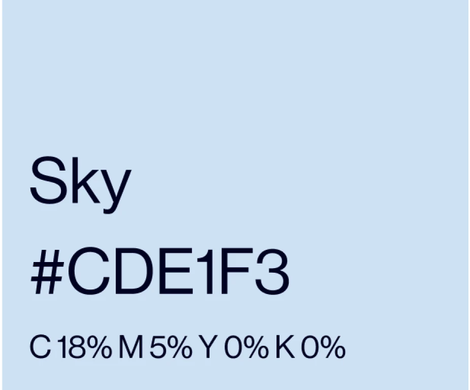
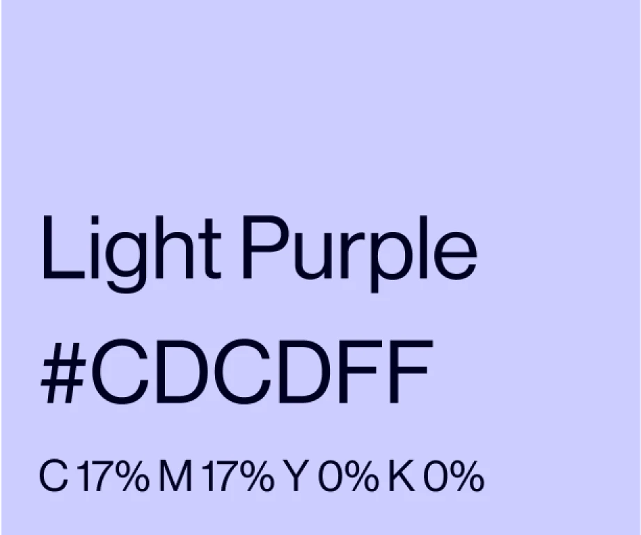
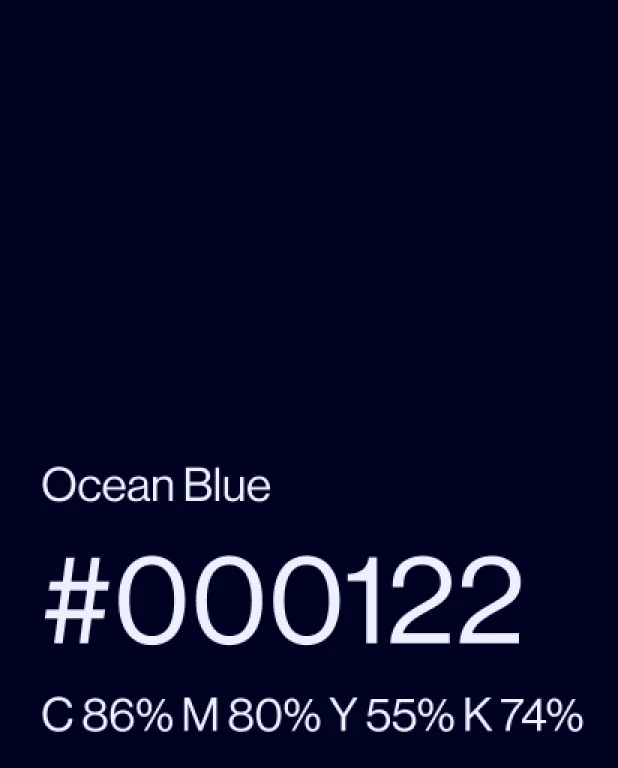
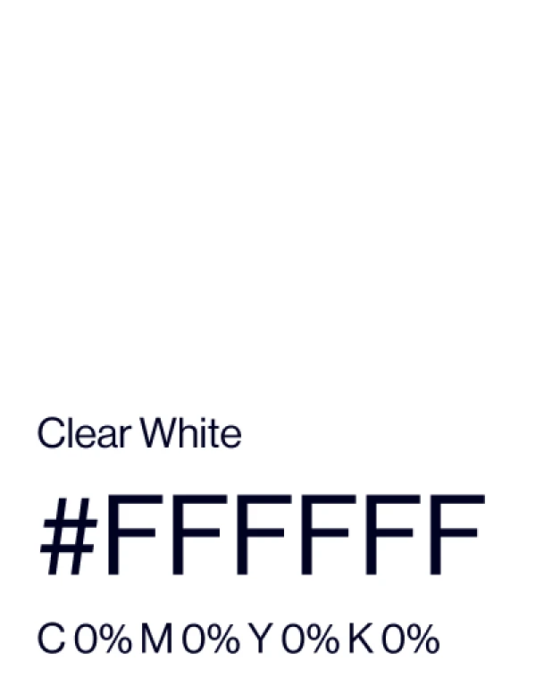
Colours
Main colours
The main colours are ORC's brand colours and should always be used.
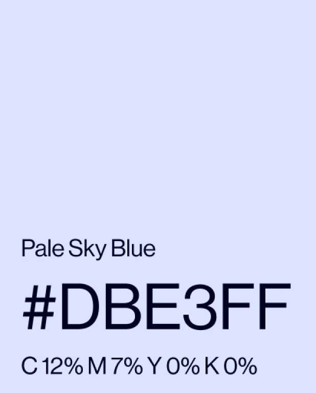
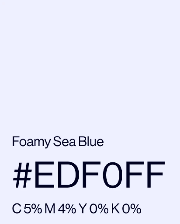
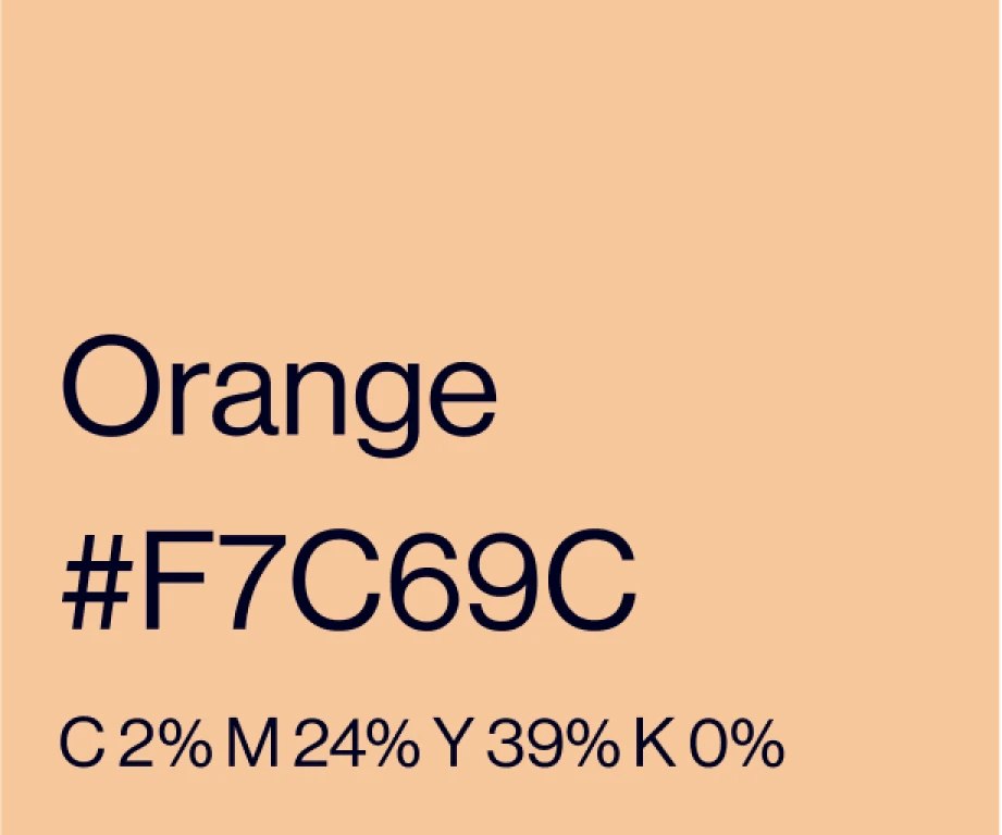
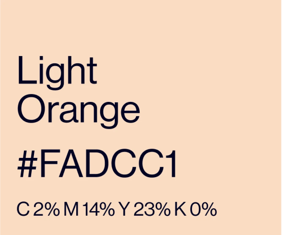
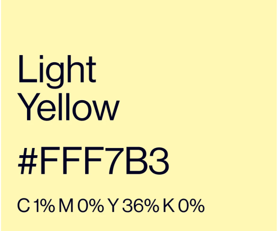
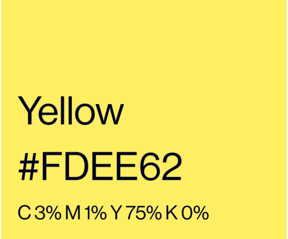
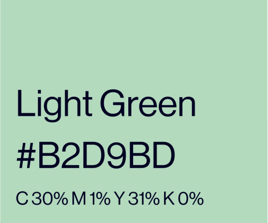
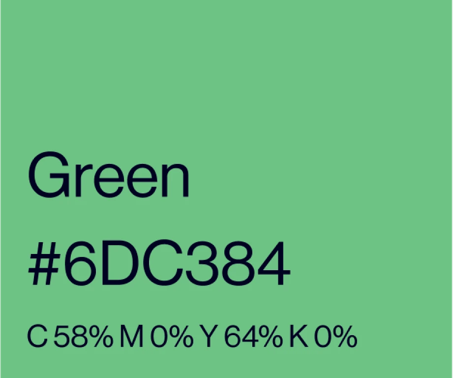
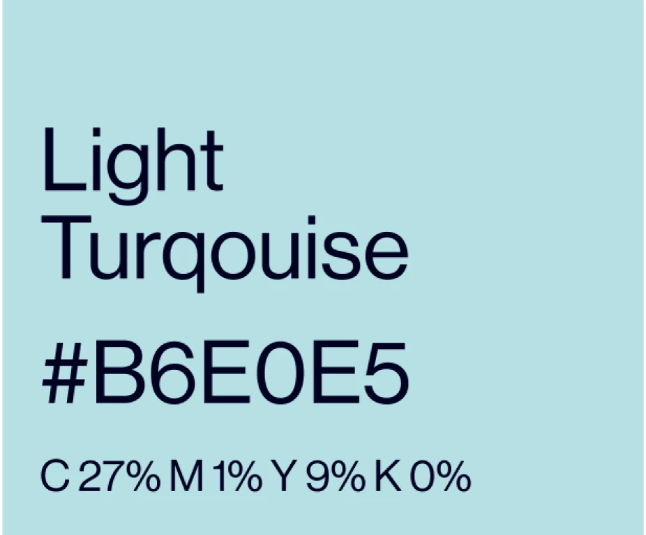
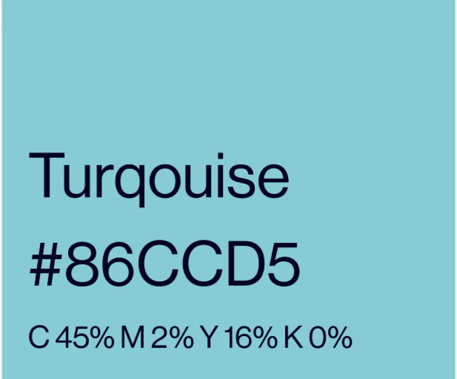
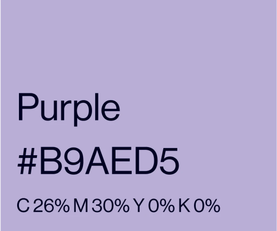
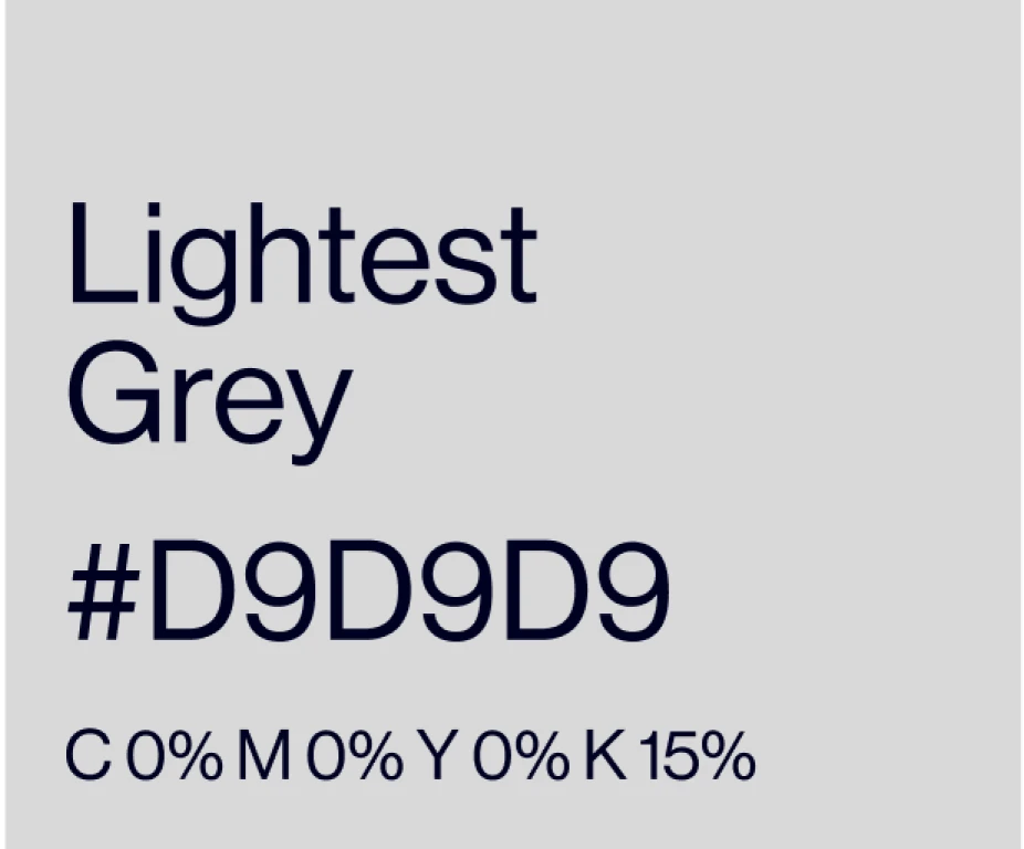
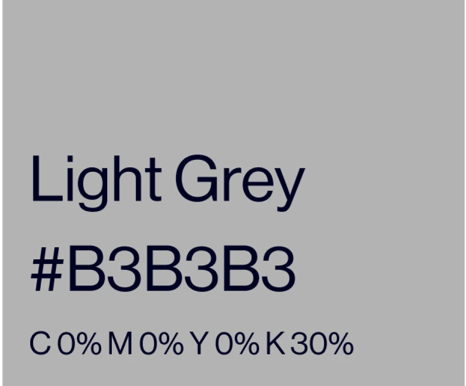
Secondary colours
The secondary colours are used for everything that relates to the ORC, but needs to be able to tell apart, such as ORC classes, Rule Books and much more.